Background images are usually used in places that have some text or content on top. It can be a slider, a featured image of the blog post (like below) or a hero image.
Chances are they’re loading slow and can affect user experience due to the increase in Largest Contentful Paint (LCP) if they’re in the above fold.

Table of Contents
Why are Background Images Slow?
Low priority requests
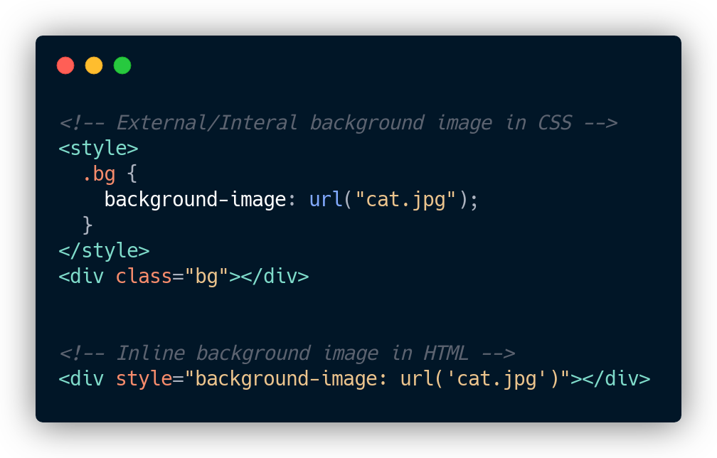
If the image is inside an external CSS file, it will be downloaded only after downloading and parsing the CSS file, and when the CSS class is actually used in HTML.
This can reflect in your core web vitals metric like Largest Contentful Paint (LCP) if those background images are in the above fold.
If it’s an IMG tag, the image is downloaded instantly when HTML is parsed.
Hard to Lazy Load & Preload
IMG tags can leverage native browser lazy loading, which doesn’t require any JavaScript.
You can still lazy load background images if they’re in HTML as an inline style. Plugins like FlyingPress automatically detect and lazy load them.
However, if the background image is inside an external CSS file or internal, things will get tricky as we can’t figure out whether an HTML element has a background image or not.
Note: If you’re using FlyingPress, we have a helper class “lazy-bg” to lazy load background images even inside CSS files.
How to Speed Up Background Images?
Use IMG tag with object-fit
Background images are commonly used in sliders with some text/content in the centre, or you have a fixed div, and you want to place an image that will ‘fill’ without resizing area (background-size: cover).
Previously it was really hard to achieve this with IMG tags. So using background images made sense.
However, there is a new CSS property object-fit: cover that gives with the same benefit. Browser support is also good.

Preload background image
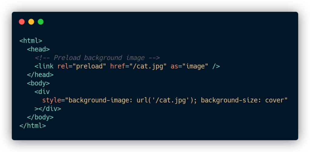
Whether you’re using a background image or IMG tag if the image is in the above fold, preload that image. Preloading tells the browser to download that image on high priority.
IMG tag with ‘display: none’ hack
Background images can be used in conjunction with background-color, background-repeat, background-attachment, background-position, and background-blend-mode etc.
So in some situations, it’s better to use background-image instead of an IMG tag to leverage other CSS properties.
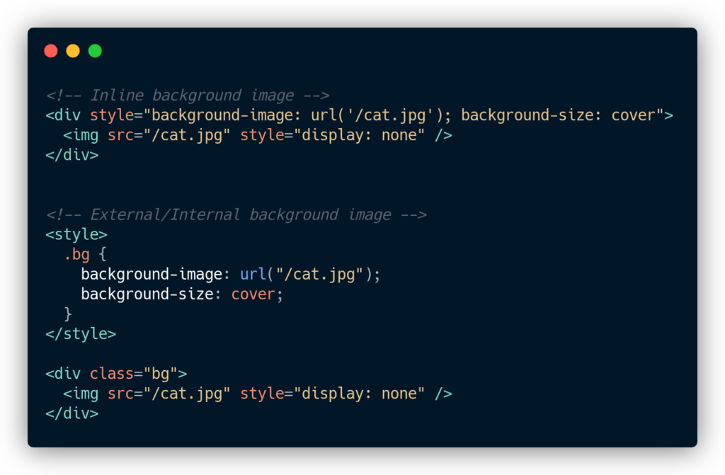
You can add a normal IMG tag with display: none. This will tell the browser to download the image immediately, but display it using a background image.
Add responsive images
You add srcset and sizes to normal images to deliver responsive images based on the device:
<img srcset="elva-fairy-320w.jpg 320w,
             elva-fairy-480w.jpg 480w,
             elva-fairy-800w.jpg 800w"
     sizes="(max-width: 320px) 280px,
            (max-width: 480px) 440px,
            800px"
     src="elva-fairy-800w.jpg" alt="Elva dressed as a fairy">
Similarly, you can do the same for background images using image-set:
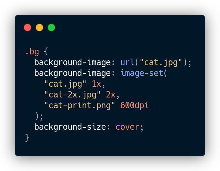
Otherwise, you will be delivering the same large image for a 2880px MacBook and 750px iPhone 6s!
Inline background image in HTML
If your background image is inside an external CSS file, inline it in the HTML. This way browser doesn’t have to wait for downloading that CSS file and then download the image.
