Table of Contents
Why you should Optimize Images?
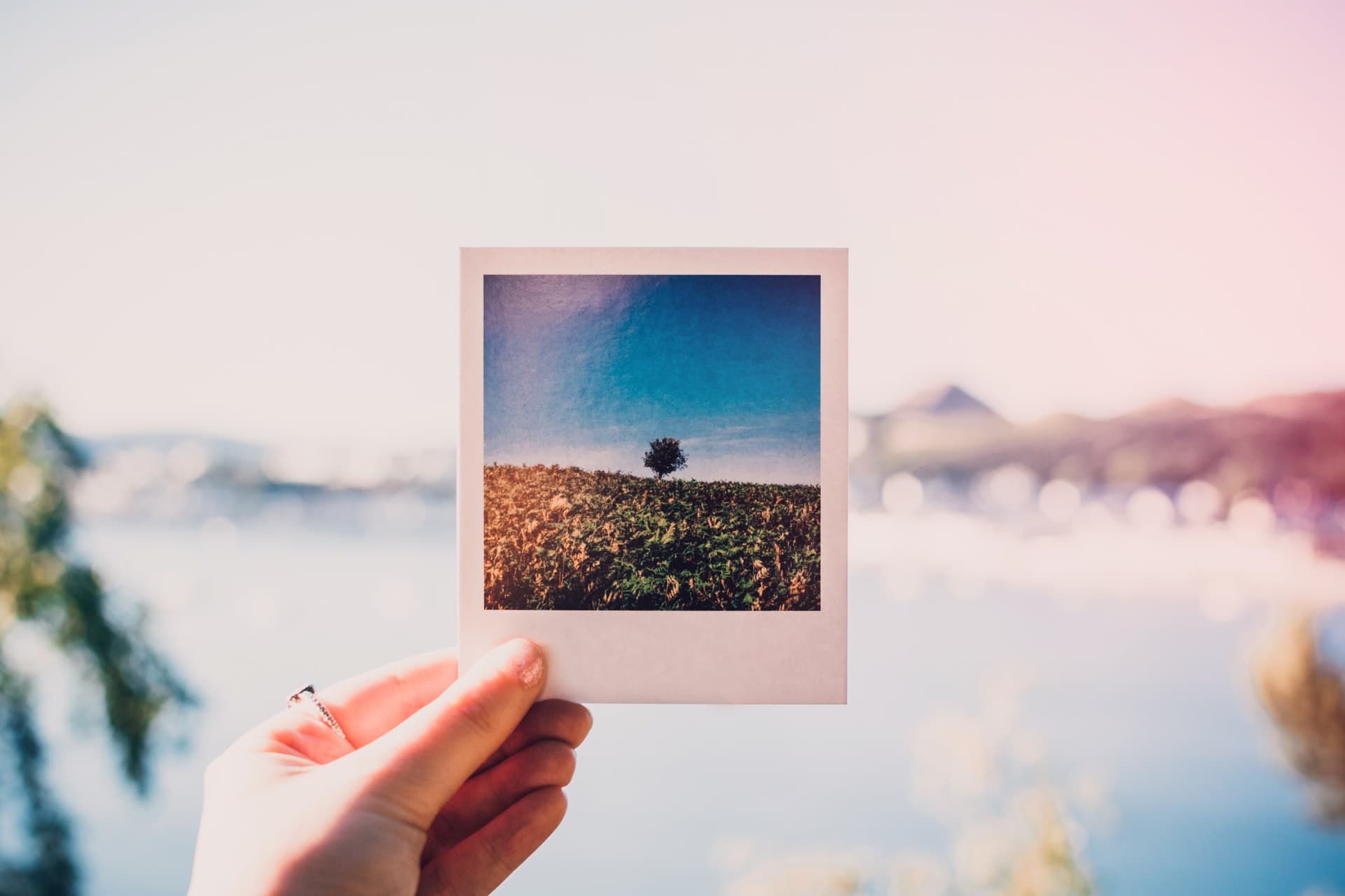
I hope the above picture should give you some idea.
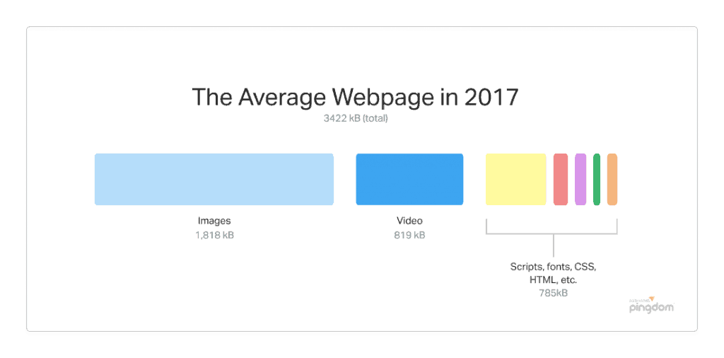
As technology grows, the camera quality has improved a lot. Even new mobiles like iPhone, OnePlus will capture images at resolution 4032 x 3024 pixels, and the size of few MBs. Normal devices like desktop may have a width of 1500-2000 pixels and mobiles up to 800 pixels.
Optimizing images can reduce 50 – 70% of your total web page size and speed up total load time by 2x or 3x.
Use Next-Gen Image Formats
You must already aware of the image formats JPEG, PNG and GIF. But these are not the only options and the best.
WebP
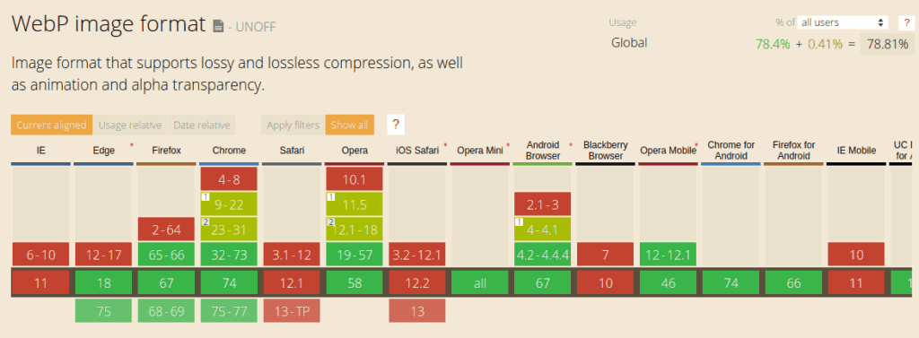
WebP is a new image format that is developed by Google. Any image of the format JPEG, PNG, GIF can be converted to WebP which will reduce the size up to 90%.
Here is a comparison:


As you can see the same image when converted to WebP resulted in a 57% decrease in size.
Even though WebP is fairly new, it’s supported by most of the modern browsers.
WebP in WordPress
The easier way to deliver WebP is via a CDN (recommended, discussed below). But if you’re not ready for a CDN due to some reason, you can install the WebP Express WordPress plugin that will do the job.
SVG
SVG is a vector image format, while JPEG, PNG, GIF, WebP are raster images. If you’re not sure about what these are, SVG images are images represented as code. Browser paints the image looking at this code. It will not lose quality however you zoom in.
SVG images are ideal for icons, logos, charts, infographics etc. Unlike WebP, not every image can be converted to SVG (technically it’s possible but the result would be a higher size image). SVG images need to be drawn by Adobe Illustrator, Sketch or similar software.
SVG in WordPress
SVG by default is not supported by WordPress. You can install SVG Support that will enable this.
That’s all you need, just upload .svg files like normal images!
Base64 / Inline Images
Any image represented as 64 characters of text is called a base64 image. Hard to understand right?
Let’s take a look at the code. A normal image in HTML looks like this:

Here is how the base64 image looks like:

Instead of URL, base64 is a string that starts like data:image/png;base64. The first portion represents the type of data. The characters after the comma(“,”) represent our image.
The advantage over URLs is that the data required for rendering the image is already provided in the HTML source code, so the browser doesn’t need to make an extra HTTP request and download the file.

Pros:
- No extra HTTP request to download image
- Faster render
- Ideal for images in the above fold, logo, placeholders etc
Cons:
- Converting image to base64 results in a 30% increase of size
- Couldn’t leverage browser caching
Base64 / Inline Images in WordPress
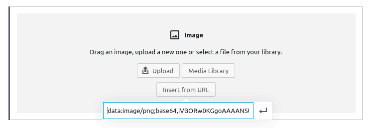
You can convert any image to base64. Go to https://www.base64-image.de/ and upload your image. After the conversion is complete click ‘copy code’.
In the Gutenberg editor, choose an image and select ‘Insert from URL’ and paste the code we copied. Done!
Compress Images
There are several image encoding algorithms that can compress the images that will reduce the size of the image. It will speed up your website as well saves you a lot of bandwidth.
Here is an example:

Both of these images have the same dimensions. But as you can see the size has been reduced from 80KB to 30KB (62%).
If you want to know more about image compression, check out this post from KeyCDN.
Image Compression in WordPress
Using Plugins
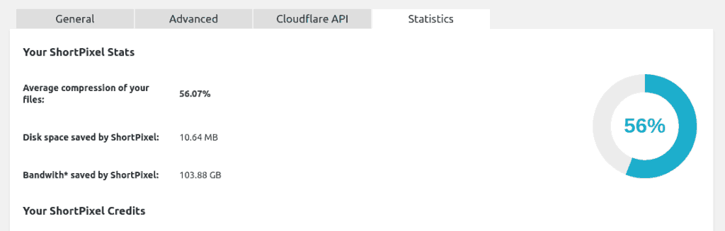
There are several plugins available that can compress images. My favourite one is ShortPixel. ShortPixel sends each image to their servers and does the best compression available. They support lossy, glossy and lossless compression. It can also generate WebP.
- ShortPixel (recommended) – Best compression, free up to 100 images/month
- reSmush.it – Completely free for images with max size 5MB
- Optimole – Free up to 1GB of images per month
Without Using Plugins
There are several online tools to compress images. The one I commonly use is compressor.io. It’s free, fast, lossy/lossless and supports all formats.
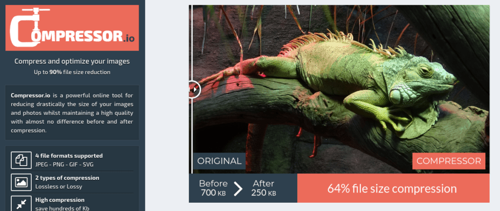
- Compressor.io (recommended) – All file formats
- TinyPNG – PNG, JPG
- Svgomg – SVG
Responsive Images
Your theme might be responsive, but your images maybe not. Delivering an image of width 1500px to mobile of width 800px doesn’t make sense!
Here is an example. Same image delivered in different sizes (let me know if you notice any difference).

Usually, an image added to HTML looks like this:

The problem with this approach is that whether users device is mobile or desktop, the same large image will be delivered.
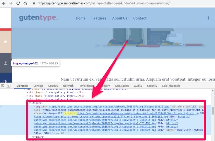
HTML supports srcset for images which tells the browser which image to load based on the device width/PPI.
Images with SRCSET:
You can check whether your theme supports srcset by right-clicking on any image and select ‘Inspect Element’. It will look something like this:
What if my theme doesn’t Support SRCSET?
You got three options:
- Ask your theme developer to fix it!
- Use plugins that will add
srcset, like FlyingPress - On the fly image resizing via CDN (recommended, discussed below)
Image Delivery via CDN
So you optimized everything with next-generation image, compression, resizing and all. But what if there is network latency or the server is slow?
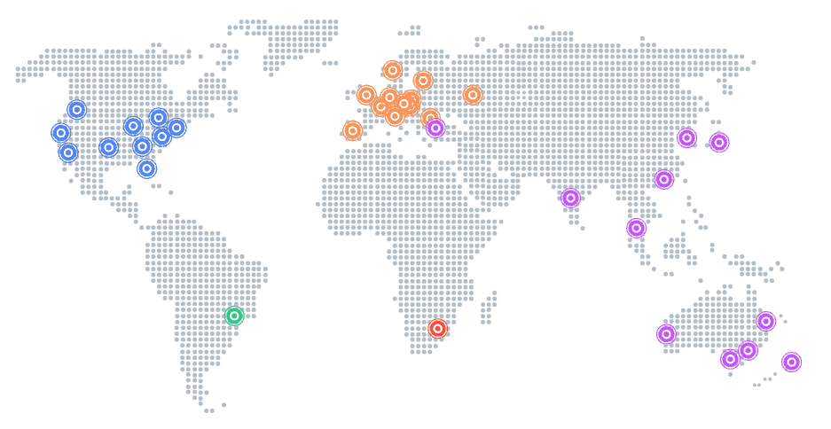
What is a CDN?
If you’re new to CDN, these are content delivery networks specially designed for delivering static files like images. What they do is save a copy of your image in their 100+ servers all around the globe. When someone requests an image, it’s delivered from the nearest server. Thus reducing network latency.
How to Pick a CDN for Images?
There are several free and paid CDN providers. However, not everyone is good at delivering images.
Here are the factors that you need to look for before choosing a CDN:
- On the fly image compression
- On the fly image resizing
- On the fly WebP conversion
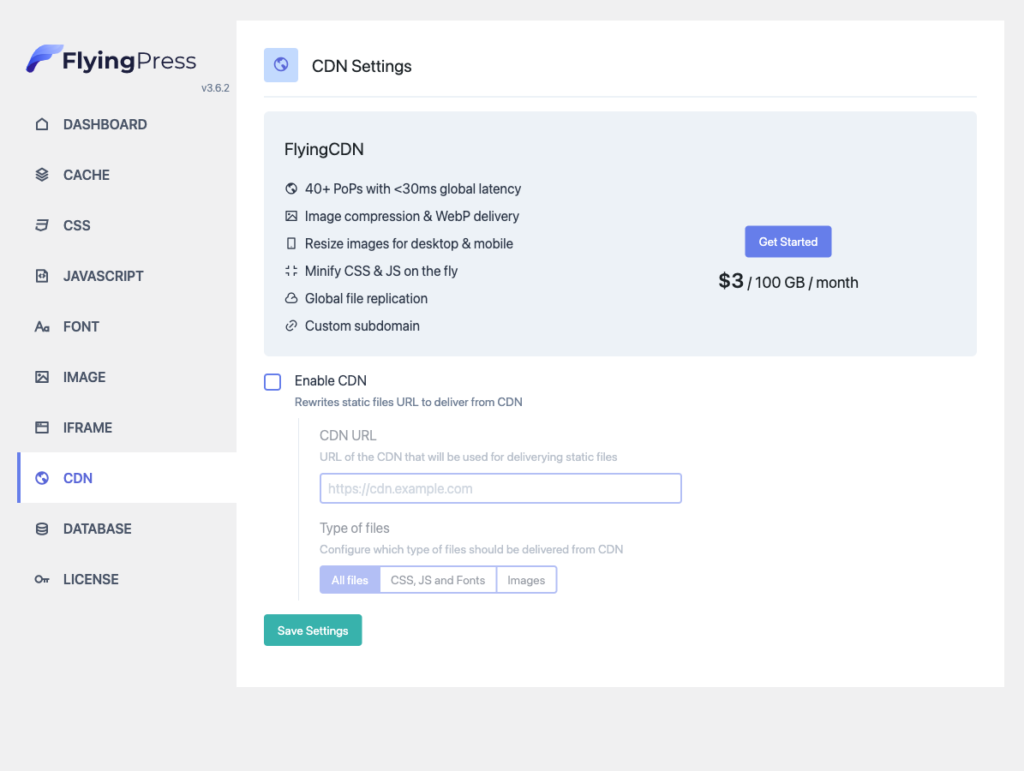
If you’re using FlyingPress, there is a FlyingCDN addon that will deliver responsive images with webp conversion, compression and everything:
ShortPixel Adaptive Images is also another option.


Conclusion
So far we’ve covered everything about image optimization. If you’re looking for a quick solution, get FlyingPress with FlyingCDN
Comment below if you’ve any queries or feedback. I read and reply to each of them within 8 hours!


Comments are closed.